Introdução
Bollards, often perceived as simple utilitarian structures, play a far more intricate role in urban and industrial landscapes than their robust forms might suggest. While their primary function is undeniably physical ‒ to protect, guide, and delineate spaces ‒ their visual attributes, particularly color, wield a profound psychological and practical influence. The choice of a bollard’s hue is not merely an aesthetic decision; it is a strategic consideration that impacts safety, directs behavior, and subtly shapes human perception within a given environment. This article delves into the fascinating intersection of color psychology, visual communication, and the functional application of bollards, exploring how specific color choices can enhance operational efficiency, improve safety protocols, and contribute to the overall harmony or deliberate contrast of a space.
From bustling city streets to serene park pathways, and from high-security industrial zones to welcoming commercial complexes, bollards serve as silent communicators. Their colors, whether vibrant or subdued, are interpreted by the human brain, often subconsciously, triggering responses that range from heightened alertness to a sense of calm. This intricate interplay between visual stimuli and human psychology underscores the importance of a well-informed approach to bollard color selection. We will explore how different colors convey distinct messages, how they are perceived under varying conditions, and the critical factors that facility managers, urban planners, and safety officers must consider when specifying these essential elements of infrastructure. By understanding the psychological underpinnings of color, we can transform bollards from passive barriers into active participants in creating safer, more
intuitive, and visually cohesive environments.

The Fundamental Role of Color in Bollard Functionality: Beyond Physical Barriers
While the primary function of a bollard is to provide a physical barrier or demarcation, its color extends its utility far beyond mere structural presence. Color acts as a powerful, non-verbal communication tool, conveying critical information to pedestrians, cyclists, and motorists alike. This visual language is often processed instantaneously, guiding behavior and enhancing safety in dynamic environments.
One of the most immediate benefits of strategic color selection is enhanced visibility. Vibrant and contrasting colors ensure that bollards stand out against their surroundings, making them more easily discernible, especially in complex or fast- moving scenarios. This increased visibility directly contributes to a reduction in accidental impacts and collisions. For instance, a brightly colored bollard at a crosswalk serves as an unmistakable warning, drawing attention to a pedestrian zone that might otherwise be overlooked. The human eye is naturally drawn to certain hues, and leveraging this innate response can significantly improve situational awareness for all individuals navigating a space.
Beyond simple visibility, color plays a crucial role in wayfinding and the clear delineation of specific areas. Through strategic color coding, bollards can effectively communicate the intended use of a space. Imagine a series of bollards marking a vehicle exclusion zone; if these bollards are uniformly colored in a highly visible, attention-grabbing shade, they immediately signal a boundary that should not be crossed by vehicles. Similarly, different colors can be used to differentiate between pedestrian pathways, cycling lanes, and vehicular traffic areas, creating an intuitive visual language that helps prevent confusion and potential hazards. This systematic approach to color application transforms static objects into dynamic elements of an integrated safety and navigation system.
Furthermore, the effectiveness of bollard color is not limited to daylight hours. The integration of reflective banding dramatically boosts a bollard’s visibility under low- light conditions, such as dawn, dusk, or nighttime. Retroreflective materials are engineered to amplify and return light towards its source, meaning they shine brightly when illuminated by vehicle headlights or other light sources. To maximize this effect, reflective bands should be strategically placed to highlight the bollard’s height and perimeter. The use of contrasting reflective colors against the primary bollard color further enhances definition, ensuring that the bollard remains a clear visual cue 24
hours a day, seven days a week. This continuous visual communication is paramount for maintaining safety and operational efficiency around the clock .
In essence, the color of a bollard is not an afterthought but a fundamental component of its functional design. It transforms a passive physical barrier into an active participant in managing space, guiding movement, and safeguarding individuals. By understanding and applying the principles of visual communication through color, bollards become more than just protective structures; they become integral elements of a comprehensive safety and environmental management strategy.
The Psychological and Perceptual Impact of Specific Colors in Bollard Design
The human perception of color is a complex phenomenon, influenced by a combination of physiological responses, psychological associations, and cultural conditioning. When applied to bollards, these color attributes can be harnessed to elicit specific behaviors and convey distinct messages, thereby optimizing their effectiveness in various environments. Understanding the nuanced impact of individual colors is crucial for informed design and deployment.
Yellow: The Universal Signal of Caution and Alertness
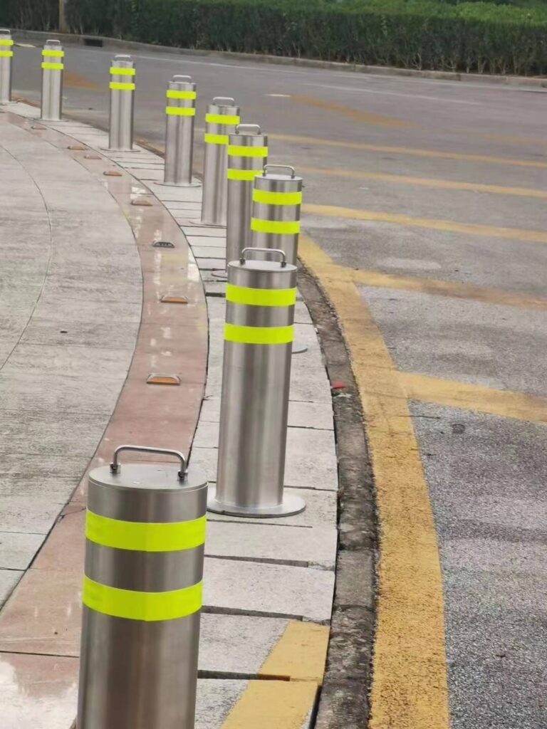
Among the spectrum of colors, yellow stands out as a particularly potent visual cue, widely recognized for its association with caution and its ability to command attention. Its prominence in safety applications, from road signs to construction equipment, is no coincidence. Psychologically, yellow is often linked to warning and alertness, instinctively prompting individuals to slow down, observe, and proceed with care. This innate response is rooted in the fact that the human eye is exceptionally sensitive to yellow, making it one of the most visible colors, even in challenging conditions such as low light or high-traffic areas. Its high light reflectance value ensures that it stands out across various lighting scenarios, and its detectability in peripheral vision is critical in environments where rapid reactions are necessary. Studies have consistently shown that yellow can be perceived from greater distances than many other colors, making it an ideal choice for bollards intended to signal potential hazards or clearly delineate pedestrian pathways. By stimulating mental alertness, yellow bollards contribute to faster reaction times to obstacles and have been demonstrably effective in reducing accidents in areas requiring traffic control or
enhanced pedestrian safety. The subconscious promotion of caution by yellow bollards makes them invaluable tools for creating safer public and private spaces.

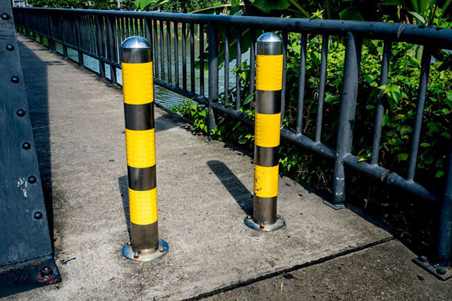
Red: The Unmistakable Mark of Danger and Prohibition
Red, a color of intense visual impact, carries a universally understood message of danger, stop, or prohibition. Its strong psychological association with urgency and warning makes it an unambiguous signal in critical areas. When red bollards are deployed, they immediately communicate a clear boundary or restriction, such as areas where parking is forbidden or emergency access points that must remain unimpeded. The bold presence of red ensures that these vital messages are conveyed with authority, helping to maintain order and safety in high-risk or restricted zones.
White: Connotations of Cleanliness and Clear Delineation
White bollards, while perhaps less overtly attention-grabbing than yellow or red, serve a distinct and important purpose. Their high visibility, particularly against darker backgrounds, makes them excellent for clear delineation. Psychologically, white is often associated with cleanliness, purity, and order. This makes white bollards a suitable choice for environments where hygiene and clear spatial organization are paramount, such as food processing plants, laboratories, and hospitals. Additionally, white bollards are frequently used to mark parking spaces or define travel lanes, providing a crisp and unambiguous visual guide.
Orange: The Dynamic Indicator of Temporary Hazards
Orange, often used in conjunction with yellow, is another highly visible color that effectively signals temporary hazards or changes in environment. Its vibrant hue makes it particularly effective in construction zones or areas where temporary footpaths are established. The psychological impact of orange is one of dynamism and urgency, making it an excellent choice for situations that require immediate attention and adaptation from individuals navigating the space.
Blue: Guiding and Informing with Serenity
While less common for direct hazard warning, blue bollards can play a significant role in guiding and informing. Psychologically, blue is associated with calmness, trust, and reliability. In specific contexts, such as airport terminals, blue bollards can be used to
subtly direct travelers, providing a sense of order and reducing confusion. Their presence can contribute to a more serene and organized environment, particularly in large, complex public spaces.
Black: The Epitome of Elegance and Subtlety
Black bollards are often chosen for their aesthetic appeal, conveying a sense of elegance, sophistication, and understated presence. Unlike their brightly colored counterparts, black bollards are typically employed in environments where visual harmony and integration with existing architecture or landscaping are prioritized over overt signaling. They can blend seamlessly into urban or architectural designs, providing necessary protection or demarcation without drawing undue attention. Their versatility makes them popular in a wide variety of settings where a sleek and refined appearance is desired.

Green: Harmonizing with Natural Landscapes
Green bollards are specifically designed to integrate harmoniously with natural environments. Their color allows them to blend into landscapes such as gardens, parks, and recreational areas, preserving the aesthetic integrity of these spaces. When the primary objective is to provide subtle demarcation or protection without disrupting the natural visual flow, green bollards offer an ideal solution. They provide functionality while maintaining a connection to the surrounding flora and natural elements.
In summary, the choice of bollard color is a deliberate act of visual communication. Each hue carries a unique set of psychological associations and perceptual characteristics that can be leveraged to enhance safety, guide movement, and contribute to the overall design intent of a given space. By carefully considering these impacts, designers and planners can optimize the effectiveness of bollards as integral components of a well-managed environment.
Factors Influencing Bollard Color Choice: A Multifaceted Decision-Making Process
The selection of an appropriate bollard color is rarely a singular consideration; rather, it is a multifaceted decision-making process influenced by a complex interplay of
functional requirements, environmental contexts, material properties, and regulatory mandates. A holistic approach to this choice ensures that bollards not only fulfill their primary protective role but also contribute optimally to the safety, aesthetics, and efficiency of their intended location.
Functional Purpose: Defining the Primary Objective
The foremost factor in determining bollard color is its overarching functional purpose. Is the bollard primarily intended for traffic control, guiding vehicles and pedestrians along specific paths? Is its main role to enhance safety by marking hazards or preventing unauthorized access? Or is its contribution predominantly aesthetic, designed to blend seamlessly into a sophisticated architectural design or to subtly enhance the visual appeal of a public space? Each of these objectives dictates a different approach to color selection. For instance, a bollard whose primary function is to alert and protect will necessitate a highly visible, attention-grabbing color, whereas one intended for subtle demarcation in a landscaped area might call for a more subdued, harmonizing hue. Understanding this core purpose is the foundational step in the color selection process.
Visibility Requirements: Standing Out or Blending In
Closely tied to functional purpose are the specific visibility requirements of the bollard. In environments where the bollard must serve as an unmistakable warning or a clear directional cue, high visibility is paramount. This often translates to the use of bright, contrasting colors like yellow or orange, especially in areas with high traffic, potential hazards, or low ambient light. Conversely, in settings where the bollard is meant to be unobtrusive or to integrate harmoniously with its surroundings, a color that blends rather than stands out would be more appropriate. This might include natural tones like green or brown in parks, or neutral shades like black or gray in urban architectural contexts. The decision hinges on whether the bollard needs to actively draw attention or to recede into the background while still performing its protective function.
Environmental Context: Harmonizing with the Surroundings
The surrounding environment plays a crucial role in color choice. Bollards are rarely isolated elements; they exist within a broader landscape of buildings, natural features, and existing infrastructure. The chosen color should ideally complement or at least not
clash with the prevailing palette of the area. In historical districts or areas with specific architectural styles, period-appropriate colors might be selected to maintain the site’s unique character and visual integrity. In natural settings, colors that mimic foliage or earth tones can help bollards blend in, preserving the aesthetic appeal of the landscape. Conversely, in modern urban spaces, bold and contrasting colors might be used deliberately to create focal points or to align with contemporary design principles. The goal is to ensure that the bollard contributes positively to the overall visual harmony or, if intended, to create a deliberate and effective visual contrast.
Material and Finish: Practical Constraints and Aesthetic Possibilities
The material from which a bollard is constructed, and its subsequent finish, significantly influence the available color options and the durability of that color over time. Different materials offer varying degrees of versatility in terms of pigmentation and coating. For example:
Powder Coated Bollards: These offer a wide range of color options, allowing for extensive customization to match branding or specific design schemes. However, they are susceptible to scratching, which can expose the underlying metal and necessitate touch-ups or repainting to maintain their appearance and protective qualities.
Painted Bollards: A cost-effective solution for adding color, painted bollards are suitable for general applications. The primary concern with paint is its tendency to chip or fade over time, requiring periodic refinishing to preserve aesthetics and visibility.
Galvanized Bollards: Hot-dip galvanizing provides exceptional durability and corrosion resistance, resulting in a natural silver finish. While some tinting is possible, extensive color customization is generally not feasible with this finish, limiting the palette to metallic tones.
Stainless Steel Bollards: Known for their sleek, modern silver finish, stainless steel bollards are low-maintenance and highly durable. Their higher initial cost is often offset by their longevity and minimal upkeep requirements. Color options are inherently limited to the natural metallic sheen of the material.
Plastic Bollards: Pigmented polymers allow for a wide variety of color choices, offering unique visual possibilities. However, plastic bollards typically lack the structural strength of steel and may not withstand heavy impacts as effectively, making them more suitable for demarcation than high-impact protection.
Understanding these material-specific characteristics is vital for making a practical and sustainable color choice that aligns with both aesthetic desires and long-term maintenance considerations.
Maintenance Requirements: Longevity and Upkeep
The chosen color also has implications for the long-term maintenance of the bollard. Lighter colors, while often highly visible, tend to show dirt, grime, and wear more readily than darker ones. This means they may require more frequent cleaning or repainting to maintain their intended visual impact and aesthetic appeal. Conversely, darker or more textured finishes might be more forgiving in terms of concealing minor imperfections or accumulated dirt. The maintenance burden associated with a particular color should be weighed against the operational budget and the desired visual standard for the installation.
Regulatory Compliance: Adhering to Standards
In many jurisdictions and specific applications, there are regulations or recommendations regarding bollard color. For instance, the Occupational Safety and Health Administration (OSHA) in the United States strongly recommends yellow bollards for many safety-related applications due to their high visibility and association with caution. Adhering to such standards is not only a matter of legal compliance but also ensures that the bollards are universally understood as safety devices within a given context. Before finalizing a color choice, it is imperative to consult local regulations, industry best practices, and any specific site requirements to ensure full compliance and optimal safety.
User Perception and Inclusivity: Considering All Individuals
Finally, the impact of color on all potential users, including those with visual impairments, should be considered. While bright, contrasting colors are generally beneficial for visibility, certain color combinations can be problematic for individuals with color blindness. Designers should strive to select colors that provide sufficient distinction and clarity for the widest possible range of users, ensuring that the safety messages conveyed by the bollards are accessible to everyone. This inclusive approach to design underscores the responsibility of creating environments that are safe and navigable for all members of the community.
In conclusion, the decision of bollard color is a strategic one, requiring careful consideration of its functional purpose, the specific visibility needs of the environment, the aesthetic context, the practicalities of material and maintenance, and adherence to regulatory and inclusive design principles. By meticulously evaluating these factors, stakeholders can ensure that their bollard installations are not only robust physical barriers but also highly effective visual communicators.

Broader Principles of Color Psychology: A Foundation for Understanding Bollard Impact
To fully appreciate the nuanced influence of bollard color, it is essential to understand the broader principles of color psychology. This field explores how different hues affect human emotions, behaviors, and perceptions, providing a foundational framework for informed design decisions. Color is not merely a visual phenomenon; it is a powerful sensory input that can evoke a wide range of responses, often at a subconscious level.
At its most basic, color is a product of light. White light, when broken down, reveals a spectrum of wavelengths, each perceived as a distinct color. Objects absorb certain wavelengths and reflect others, and it is these reflected wavelengths that determine the color we see. For instance, a yellow bollard appears yellow because it reflects the yellow wavelength of light while absorbing others. This fundamental interaction between light, object, and eye is the starting point for all color perception.
Beyond the physics of light, colors possess an inherent ability to influence mood and emotional states. This influence is often categorized into warm and cool palettes. Warm colors, such as reds, oranges, and yellows, are typically associated with energy, passion, and excitement, and can even evoke feelings of danger or urgency. Conversely, cool colors, including blues, greens, and purples, tend to promote feelings of serenity, calmness, and tranquility. The strategic application of these color temperatures can subtly shape the emotional atmosphere of a space, guiding human responses without explicit instruction. For example, the use of cool-toned bollards in a park might enhance a sense of peace and relaxation, while warm-toned bollards in a construction zone would amplify the sense of caution.
Color also plays a significant role in cognitive processing. Research indicates that certain colors and light intensities can enhance cognitive performance, improve
reaction times, and stimulate overall mental alertness. This is particularly relevant in environments where quick decision-making and heightened awareness are crucial, such as traffic intersections or industrial facilities. The visual cues provided by bollard colors can contribute to a more efficient and safer cognitive engagement with the surroundings, helping individuals to process information more rapidly and accurately.
It is important to acknowledge that while many color associations are universal, cultural significance can introduce variations. For example, while white symbolizes purity in many Western cultures, it is often associated with mourning in some South Asian traditions. While bollard design typically prioritizes universal safety signals, an awareness of cultural nuances can be beneficial in highly diverse or culturally sensitive environments. However, for the primary purpose of safety and guidance, the universally recognized psychological impacts of colors like yellow (caution) and red (danger) remain paramount.
Furthermore, colors provide instinctive, almost primal cues. The human brain is wired to associate certain colors with inherent meanings, often rooted in evolutionary experiences. The red of fire, for instance, instinctively signals danger, while the blue of water can evoke a sense of calm. These subconscious associations contribute to the immediate and often unthinking responses individuals have to colored objects in their environment. Bollards, by leveraging these deep-seated psychological connections, can effectively communicate their purpose without the need for explicit signage or complex instructions.
In essence, the selection of bollard color is an application of these broader principles of color psychology. It is about understanding how light interacts with the human eye, how different hues influence emotions and cognitive functions, and how universal and cultural associations shape perception. By integrating these insights, bollards transcend their physical form to become sophisticated tools for environmental management and human behavior guidance.
Conclusão
In conclusion, the color of a bollard is far from a superficial detail; it is a strategic imperative that profoundly influences safety, behavior, and the overall aesthetic and
functional integrity of a space. By moving beyond the perception of bollards as mere physical barriers, we recognize them as active communicators, leveraging the powerful and often subconscious language of color to guide, protect, and inform. The choice of a specific hue is a deliberate act of environmental design, one that can enhance visibility, convey critical information, and elicit desired psychological responses.
From the universal signal of caution embodied by yellow to the authoritative warning of red, and from the serene guidance of blue to the harmonious integration of green, each color in the bollard palette possesses a unique set of attributes. The selection process is a multifaceted one, requiring a careful balance of functional purpose, environmental context, material properties, and regulatory compliance. A well-chosen color can transform a simple post into a highly effective tool for traffic management, pedestrian safety, and aesthetic enhancement.
As urban and industrial landscapes continue to evolve, the role of bollards in creating safe, efficient, and visually appealing environments will only become more critical. By embracing the principles of color psychology and applying them with intention and expertise, we can unlock the full potential of these essential infrastructural elements. The strategic use of color is not just about making spaces look better; it is about making them function better, ensuring that they are safer, more intuitive, and more harmonious for everyone who navigates them. The humble bollard, through the thoughtful application of color, becomes a testament to the power of design to shape human experience.